- Introduction to analytics3 min
- Explore statistical summary9 min
- Identify outliers with Power BI visuals4 min
- Group and bin data for analysis6 min
- Apply clustering techniques4 min
- Conduct time series analysis3 min
- Use the Analyze feature2 min
- Create what-if parameters6 min
- Use specialized visuals5 min
- Exercise - Perform analytics in Power BI20 min
- Check your knowledge3 min
- Summary2 min
Introduction to analytics
Big data analytics, machine learning, and artificial intelligence (AI) focus on predictive capabilities to solve business problems. These advanced analytics methods enable organizations to make data-driven decisions and uncover new opportunities.
Analytics can transform raw data into an extensive collection of information that categorizes data to identify and analyze behavioral data and patterns. Organizations can use this information to analyze the current state of their operations and to predict future behavior and trends by asking "what-if" questions. Additionally, analytics can help with fraud detection, image recognition, sentiment analysis, overall general employee productivity, and it also often replaces cumbersome manual processes.
Consider a scenario where you ask an employee to determine the cause of a recent spike in sales. The employee might have to painstakingly inspect each sale, interview customers, talk to sales people, and examine market trends. Instead, you can use the Key Influencers visual, which uses advanced analytics, to get a faster explanation. The visual is only as good as the data that you give it, meaning you still have to collect the data and organize it. The actual analytics, however, can be done for you or at least give you an excellent start.
By reducing manual work, advanced analytics is ultimately able to help organizations make better business decisions and create actionable and meaningful results.
Traditionally, data analysis was a complex task that performed by data engineers. Today, data analysis is more accessible to, and understood by, many people within organizations and across all teams. Power BI is an exceptional tool for quickly pulling actionable insights from data. It allows you to build visuals and metrics for your data in reports and dashboards so that you and your users can analyze data insights. They can start by analyzing at a high level and drill down into those insights for more detailed information, when necessary.
In this module's scenario, you work for Tailwind Traders as a data analyst. Your task is to create reports and dashboards that support key business decisions by showing high-level insights and visuals using advanced analytics. Each team requires unique reports and dashboards:
- The Product team wants to know if specific products aren't selling as well as others.
- The Sales team is focused on sales forecasts for the coming year.
- The Warehouse team is interested in a general breakdown of how the warehousing and shipping locations are performing worldwide.
This module outlines the built-in functionality to help you accomplish your tasks with Power BI. By the end of this module, you'll use advanced analytics to identify trends, track data changes, and create predictive models. These features can help your organization make better business decisions, plans, and forecasts.
Explore statistical summary
Data is often intertwined with statistics because statistics are one way in which you can explore your data. Statistics can show you the distribution of your data, help you to identify key takeaways and trends, and determine whether outliers exist.
A statistical summary provides a quick and simple description of your data. Power BI has many features that help you conduct a statistical analysis. Exploring the statistical summary gives the user a high-level view of the available data, where they can see clusters, patterns on behavioral data, data averages, and more. They can gain insights about their data that help drive business decisions.
For example, the Supply Chain team asks you to create a report that shows the frequency of orders for certain products and what the top 10 products are in terms of sales.
Statistical functions
Power BI supports many Data Analytics Expressions (DAX) functions that you can use to get quick statistics based on your data. You can access these quick functions by right-clicking a summarizable field assigned to the well of a visual in the Visualizations pane, as illustrated in the following image.

However, to avoid performance issues, it's better to create the statistical measures yourself by using an expression written in DAX. For example, to analyze the average order quantity for each product, you could create the following measure:
DAXCopy
Average Qty =
AVERAGE ( Sales[Order Qty] )
Histogram
Histograms and bell curves are a common way to display statistics about your semantic models. In Power BI terms, you can represent a histogram with a bar or column chart visual and represent a bell curve with an area chart visual, as illustrated in the following image. You can also use the Q&A visual to ask a direct question about the top or bottom items in a list.

A typical bar or column chart visual in Power BI relates two data points: a measure and a dimension. A histogram differs slightly from a standard bar chart in that it only visualizes a single data point.
In this example, you can use the clustered column chart visual to present a histogram that determines the order quantities by order sizes.
You start by selecting the clustered column chart icon on the Visualization pane. Next, create a new grouping for the X-axis. We cover grouping and binning later in this module, but for now understand that they're useful in this context also.
To create the group, in the Data pane, right-click the data field that you want to analyze and then select New Group. In this case, you use the OrderQty field. In the Groups window, configure the bin group as follows:
- Rename the group as Order Bins (Buckets).
- Set the Group type option to Bin and the Bin Type option to Number of bins.
- Set the Bin count to 5, the Min value to 1, and the Max value to 44.

Next, populate the visual as follows:
- Drag the
OrderQtyfield from the Data pane into the Value well in the Visualizations pane. - Drag the
Order Bins (Buckets)field from the Data pane into the Axis well in the Visualizations pane.

The visual now shows that the data is grouped into buckets on the X-axis, with the order quantities of that variable on the Y-axis.
The histogram displays the order quantity by order size buckets for the Supply Chain team.
Top N analysis
The TOPN DAX function returns the top N rows of a specified table. Top N analysis is a common technique to present data that might be important, such as the top 10 selling products, top 10 performers in an organization, or top 10 customers. Alternatively, you can look at it from the other perspective and present the bottom N items in a list. In other words, the worst performers. Depending on the requirements, you might want to use one or both of these techniques.
Consider a scenario where the Supply Chain team wants to know what the top 10 selling products are. You can accomplish this task by using a Q&A visual, a Top N filter, or creating a DAX measure.
Use the Q&A visual to find the top N
Assume you created a report for the Supply Chain team, and now the team members have questions about various other views or insights that they're interested in. Power BI has a built-in Q&A visual that allows users to ask their own questions and get answers. That means you don't have to address each individual question with a report visual.
The Q&A visual is an effective tool because it allows users to quickly and independently get answers about the data. That saves time for everyone involved. The Q&A visual is unique in that it doesn't require prior knowledge of Power BI; users can ask their question.
Add the Q&A visual to your report, and then reposition the visual and customize its formatting, as required.

Now, you can use the visual to get answers. In this case, you want to know what the top 10 selling products are, so you enter a question such as, What are my top 10 products by sales? Power BI automatically displays the result for you.

Use a Top N filter
Top N is a filtering option that is available in the Filters pane. Select the field that you want to analyze on your report page (in this example, it's the Product Name field). In the Filters pane, expand the Filter type list and select Top N. In the Show items settings, select Top and 10. Then, set the Cost of Sales field as the value that you want to filter by.

Use a TOPN function
You can also calculate your top 10 products with DAX by using the TOPN function. This function can be used to present a top 10 list in a different context, such as how much of the top 10 best-selling products contributed toward the overall total sales.
Start by creating a measure named Top 10 Products. Then, use the TOPN function along with the SUMX function, to calculate the top 10 products by total sales, as follows:
DAXCopy
Top 10 Products =
SUMX (
    TOPN (
        10,
        'Product',
        'Product'[Total Sales]
    ),
    [Total Sales]
)
The following image shows the top 10 products compared to total sales.

You can adjust the DAX formula to present the same result in percentages.
For more information about the statistical capabilities of DAX, see Statistical Functions.
Identify outliers with Power BI visuals
An outlier is a type of anomaly in your data. It's something that you don't expect or that surprises you, based on historical averages or results. You should identify outliers to isolate data points that significantly differ from other data points, and then take action to investigate the reasons for the differences. This analysis can make a significant effect on business decision making.
Consider a scenario where you're analyzing data for a shipping warehouse. You notice that the number of orders increased above average for a specific product category. You first want to identify the product category. Then, you want to ask several questions about the outlier, like:
- Did above average shipments happen that day?
- Did this anomaly occur in a specific warehouse?
- Did a single event cause the increase in orders for that specific category?
- Did this event occur on other days in the last month, quarter, year, or prior year?
Power BI allows you to identify outliers in your data, but you first need to determine the logic behind what constitutes an outlier. You can use trigger points, such as calculations, around what you would consider the outlier to be.
The process of identifying outliers involves segmenting your data into two groups: one group is the outlier data and the other group isn't. You could use calculated columns to identify outliers, but the results would be static until you refresh the data. A better way to identify outliers is to use a visualization or measures because these methods ensure that your results are dynamic.
When you identify outliers in your data, you can use slicers or filters to highlight those outliers. You can also add a legend to your visuals so that outliers can be identified among the other data. You can then drill in to the outlier data for more detailed analysis.
Use a visual to identify outliers
The best visual to use for identifying outliers is the scatter chart. It can show the relationship between two numerical values. Scatter charts display patterns in large sets of data and are, therefore, ideal for displaying outliers.
When you add a scatter chart to your report, put the fields of interest into the X Axis and Y Axis wells, respectively. In this case, the Orders Shipped field is on the X-axis, and the Qty Orders field is on the Y-axis.

The visual updates to show the data based on the selected fields, making it easy to spot outliers, which are the items separated from the main data points.

Now that you can identify outliers in your data, you can investigate the reasons for their existence and take corrective action.
Use measures to identify outliers
You can create a measure to identify outliers in your data based on specific values. In the following code, Order Qty is a measure in the Sales table, and Min Qty is a measure that determines the lowest order quantity in the Sales table.
DAXCopy
Outliers =
CALCULATE (
    [Order Qty],
    FILTER (
        VALUES ( 'Product'[Product Name] ),
        COUNTROWS (
            FILTER (
                Sales,
                [Order Qty] >= [Min Qty]
            )
        ) > 0
    )
)
After you create the outlier measure, you can group products into categories and then add the measure to a scatter chartvisual to analyze and act on outliers.
Group and bin data for analysis
Completed100 XP
- 6 minutes
When you create visuals, Power BI filters, groups, and summarizes underlying data. You can refine how those groups are presented. You can also create new groups by grouping two or more data points in a visual or by putting values into equal-sized groups (binning).
Grouping is a technique for categorizing data. Binning is similar to grouping, but it's a technique for grouping continuous fields, such as numbers and dates.
You can use the grouping and binning features to display your data according to your preference. These features help you to clearly view, analyze, and explore the data and trends in your data. Additionally, can identify clusters, patterns of behavior, data averages, and more. The results of this analysis provide users with more specific insights on their data, which can help drive business decisions.
Consider a scenario where the Customer Service team now wants you to further analyze their help ticket data and asks whether you can segment the data into different groups and clusters. In particular, they want to identify the cities with the highest sales.
Create a group
The following image shows a bar chart where Power BI automatically segmented the data in the way that it found most useful: Total Sales by State. However, you want to group some of the bars (states) together so that you can view them as one category, which helps the Sales team identify the cities with the highest sales.
To create the group, use Ctrl+Click to multi-select the data points in the visual that you want to group. In this case, it's the states with sales greater than 500,000 dollars. Right-click one of those selected data points and then select Group data.

When the group is created, notice that the visual updates to show the new group. The following image shows that the other states, which are the states with lower sales (less than 500,000 dollars), grouped together and highlighted in a different shade.

The new group field displays in the Legend well of the visual, and is also added to the data model and listed in the Datapane.
When you create a group, you can change the way that the data is displayed in the visual. For example, you might want to switch the values in each axis. You can also use the group in any of the other visuals in your report. To do so, drag the group field from the Data pane and then drop it into any visual.
Edit a group
Continuing with the previous example, you now want to edit the categories that make up your group. Right-click the group field in either the Legend well or the Data pane, and then select Edit Groups.
In the Groups window, you see a list of the groups and the different items within those groups. The following image shows the States with Sales > 500k group and its members, along with the Other group (States with Sales < 500k) that contains all other values that don't belong to the first group. If you refresh your data, new items appear in the ungrouped values list and go into the Other group.

You can now make changes to the group. You can rename any group by double-clicking the group title in the Groups and members section and entering a new name. You can also add ungrouped values into an existing group, remove values from an existing group, or create a new group.
Create bin groups
The process of binning allows you to group your numerical and time field data into bins of equal size. This approach allows you to visualize and identify trends in your data in more meaningful ways. Binning allows you to right-size the data that Power BI displays.
In this example, you want to create bins (groups) for the Order Qty field. Start in the Data pane by right-clicking the Order Qty field that you want to create the bins for, and then select New Group. In the Groups window, set the Bin sizeto the size that you want, adjust other settings as required, and then select OK.

When you set up the bin group, you see a new field in the Data pane with (bins) appended to its name. You can then add that field to any visual.
Apply clustering techniques
Clustering allows you to identify a segment (cluster) of data that's similar to each other but dissimilar to the rest of the data. The process of clustering is different to that of grouping, which you learned about in the previous unit.
The Power BI clustering feature allows you to quickly find groups of similar data points in a subset of your data. It analyzes your semantic model to identify similarities and dissimilarities in the attribute values, and then it separates the data that has similarities into a subset of the data. These subsets of data are referred to as clusters.
For example, you might want to look for patterns in your sales data, such as the behavior of customers overall. You can segment customers into clusters according to their similarities, such as age or location.
Start by adding the scatter chart visualization to your report and then add the required fields to the visual. In this example, you add the Order Qty field to the A-axis, the Sales field to the Y-axis, and the Unit Price field to the Values.
The following image shows considerable data in the scatter chart, so it's difficult to discern any natural groups.

To apply clustering to your scatter chart, select More options (…) in the upper-right corner of the visual, and then select Automatically find clusters.
In the Clusters window, you can edit the default name, field, and description, if necessary. However, for this example, you want to change the number of clusters. The following image shows that the Number of clusters box is blank by default, which means that Power BI automatically finds the number of clusters that it determines as making the most sense with your data.

Enter the number of clusters that you want (3) into the box and then select OK. Power BI runs the clustering algorithm and creates a new categorical field that contains different cluster groups. Now, when you look at the visual, you can clearly see the clusters that are in your data and proceed to perform analysis on them.

The new cluster field is added to your scatter chart's Legend well, which you can now use as a source of cross-highlighting like any other Legend field. The new cluster field is added to the data model, and you can find it in the Data pane.
If you want to edit the cluster, right-click the cluster field and select Edit clusters.

In the preceding example, when you applied clustering to the scatter chart, you could only use two measures. If you want to find clusters by using more than two measures, you can use a table visual instead. In this case, add all the fields you want to use, and then run the clustering algorithm by using the same process.
Conduct time series analysis
Time series analysis involves analyzing a series of data over time in order to identify meaningful information and trends and even make predictions. The result of time series analysis is the best data that you can use for forecasting activities.
In Power BI, you can use various visuals to observe how your data progresses over time and detect any major events that might have disrupted your data. For example, Gantt charts are useful for project planning, while stock movement semantic models help in tracking stock trends.
To conduct a time series analysis, use visualization types suited for displaying trends and changes over time, such as line charts, area charts, or scatter charts.
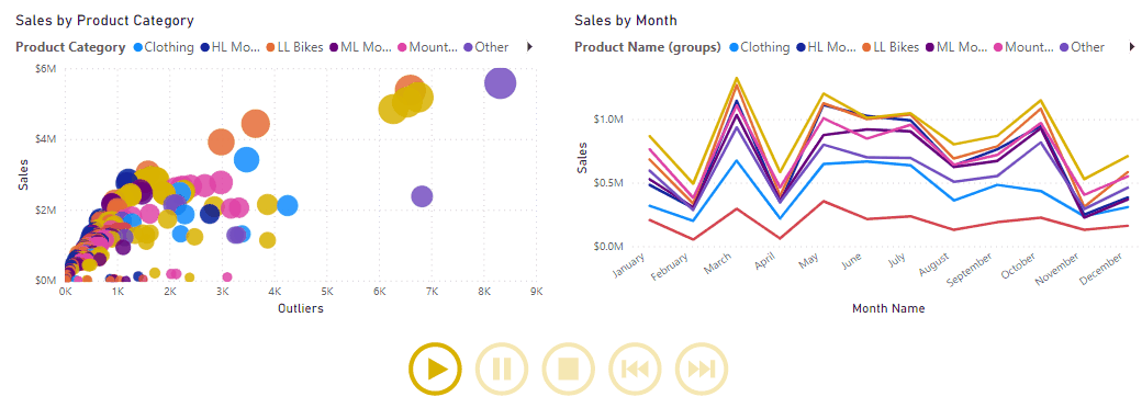
Use the Play Axis visual
You can also import custom visuals from Microsoft AppSource, like the Play Axis animation visual, which acts as a dynamic slicer to compellingly display time trends and patterns without user interaction.
Note
Some organizations prefer not to use custom visuals for security or other reasons. Before you import custom visuals, check with your organization to see whether they're allowed. If they're not allowed, you can use the scatter chart visual and its play axis instead.
Consider a scenario where you're developing a Sales report. The Sales team wants to study the quarterly sales trends and identify which models sell better, depending on the time of the season. You decide to use two visuals: a scatter chart and a line chart, for time series analysis. You then enhance those visuals with animation so the Sales team can learn how the sales data changes over time.
You start by adding your visuals to the report page to show the sales data and then importing the custom visual.

With the new visual selected, add the Quarter field to the Play Axis visual. Animation controls then become available on the visual.

You can resize, reposition, and customize the visual's formatting to match the other visuals on the page. Key formatting options include:
- Animation Settings: Control play functionality, such as autostart, looping, and animation speed.
- Colors: Adjust overall color or individual control button colors.
- Enable Caption On: Toggle text display next to the visual and adjust its formatting.

After configuring the visual, select the Play button and watch how the data in each visual on the page evolves over the time. You can use the control buttons to pause the animation, restart it, and further analysis.
Use the Analyze feature
The Analyze feature provides you with further analysis that's generated by Power BI for a selected data point in a visual. You might use this feature to see if Power BI found something new or to gain new insights into your data. This feature is useful for analyzing why your data distribution looks the way that it does.
Note
This feature doesn't work if you have non-numeric filters applied to your visual and/or you have measure filters applied.
Consider a scenario where you're developing a report for the Customer Service team that deals with help tickets. They want to analyze the ticketing data created online when a customer asks a question.
After creating a visual displaying tickets by location, you're curious about the distribution. Instead of exploring the data manually, you can use the Analyze feature to get fast, automated, insightful analysis of your data.
To use the Analyze feature, right-click a data point on the visual and then hover over the Analyze option to display two further options: Explain the increase and Find where the distribution is different. The options that are available depends on the data point that you selected.

In the following image, you select the Explain the increase option, and a window opens with a new visual.

If you find this analysis useful, you can add any of the new visuals to the report so that other users can benefit from it. Select the plus (+) icon in the upper-right corner of the visual to add it to your report.
For more information about the Analyze feature, see Apply insights in Power BI Desktop to discover where distributions vary (preview).
Create what-if parameters
You can use what-if parameters to run scenarios and scenario-type analysis on your data. What-if parameters are powerful additions to your Power BI semantic models and reports because they enable you to look at historical data to analyze potential outcomes should a different scenario occur. Additionally, what-if parameters can help you to predict or forecast what could happen in the future.
You can use what-if parameters in multiple situations. For instance, you can determine the effect of increased sales to deeper discounts, or let sales consultants see their compensation should they meet certain sales goals or percentages.
Consider a scenario where you want to find out how much growth the Sales team needs to make in order to earn 2 million dollars gross sales each month.
Create a what-if parameter
To create a what-if parameter, follow these steps:
- On the Modeling ribbon tab, select New Parameter.
- In the What-if parameter window, configure the new parameter.
- For this example, change the parameter name to Sales Forecast Percentage.
- Set the Data type to Fixed decimal number because you're using currency in your forecast.
- Set the Minimum value to 1, the Maximum value to 1.50, and the Increment value to 0.05, which is how much the parameter adjusts with report interactions.
- Set the Default value to 1.00.
- Leave the Add slicer to this page checkbox selected so that Power BI automatically adds a slicer with your what-if parameter to the current report page.


Note
For decimal numbers, make sure that you precede the value with a zero (as in 0.50 versus .50).
The new slicer visual appears on the current report page. You can move the slider to see the numbers increase according to the settings that you applied. You should also see a new field for the Sales Forecast Percentage table in the Datapane, and when you expand that field, the what-if parameter should be selected.

Similarly, you should see the measure that was also created. You can use this measure to visualize the current value of the what-if parameter.

After you create a what-if parameter, the parameter and the measure are parts of your data model. Therefore, they're available to the report and can be used on other report pages. Additionally, because the parameter and measure are part of the model, you can delete the slicer from the report page. If you want it back, you can drag the what-if parameter from the Data pane onto the canvas and then change the visual type to a slicer.
Use a what-if parameter
You need to create a new measure whose value adjusts with the slider to use the new parameter. You can create complex and unique measures that let your report users visualize the variable of your what-if parameter. However, to keep this example simple, the new measure is the total sales amount, with the forecast percentage applied, as show in the following measure expression.
DAXCopy
Gross Sales Forecast =
[Gross Sales] * [Sales Forecast Percentage Value]
Next, you create a clustered column chart with the MonthName field on the axis and the Gross Sales and Gross Sales Forecast measures as its values.
Initially, the bars are similar; however, as you move the slider, notice that the Gross Sales Forecast column reflects the sales forecast percentage amount.

Add a constant line
To enhance the visual, you can add a constant line so that you can clearly see how the organization is performing against a particular threshold or target. In this example, we add a constant line with 2 million dollars as the threshold value. Then use the slider to find out by what percentage increase sales must grow to reach the threshold. In the following image, the gross sales need to increase by 1.40 percent to reach the two million dollar threshold.
